
The identity of a brand is crucial to its success. Color, typography, photography, and the overall “aesthetic” of a brand define who the brand is and the story it is trying to tell. Creating brand identities is one of my passions, and I’m lucky enough to have been doing it professionally for years. It is incredible just how much changing one color or one font can transform an entire brand’s emotional appeal.
To show you what I mean, I’ve taken one logo and designed three completely unique mood boards around it. Mood boards are a framework that set the visual tone and personality of a project, and are often used to create brand identities. The logo I’m using today comes from KiwiNBerries on Etsy.

The logo itself is very clean and refined. Since I don’t know the actual business this logo was created for, I’m going to take it literally and say it is a greenhouse/gardening business. If I were working with a real brand I would have their mission statement, brand promise, and other assets to work with, but here we’re starting from scratch. Now that we have a logo and an imaginary business type, we’re ready to dive into my three unique mood boards!
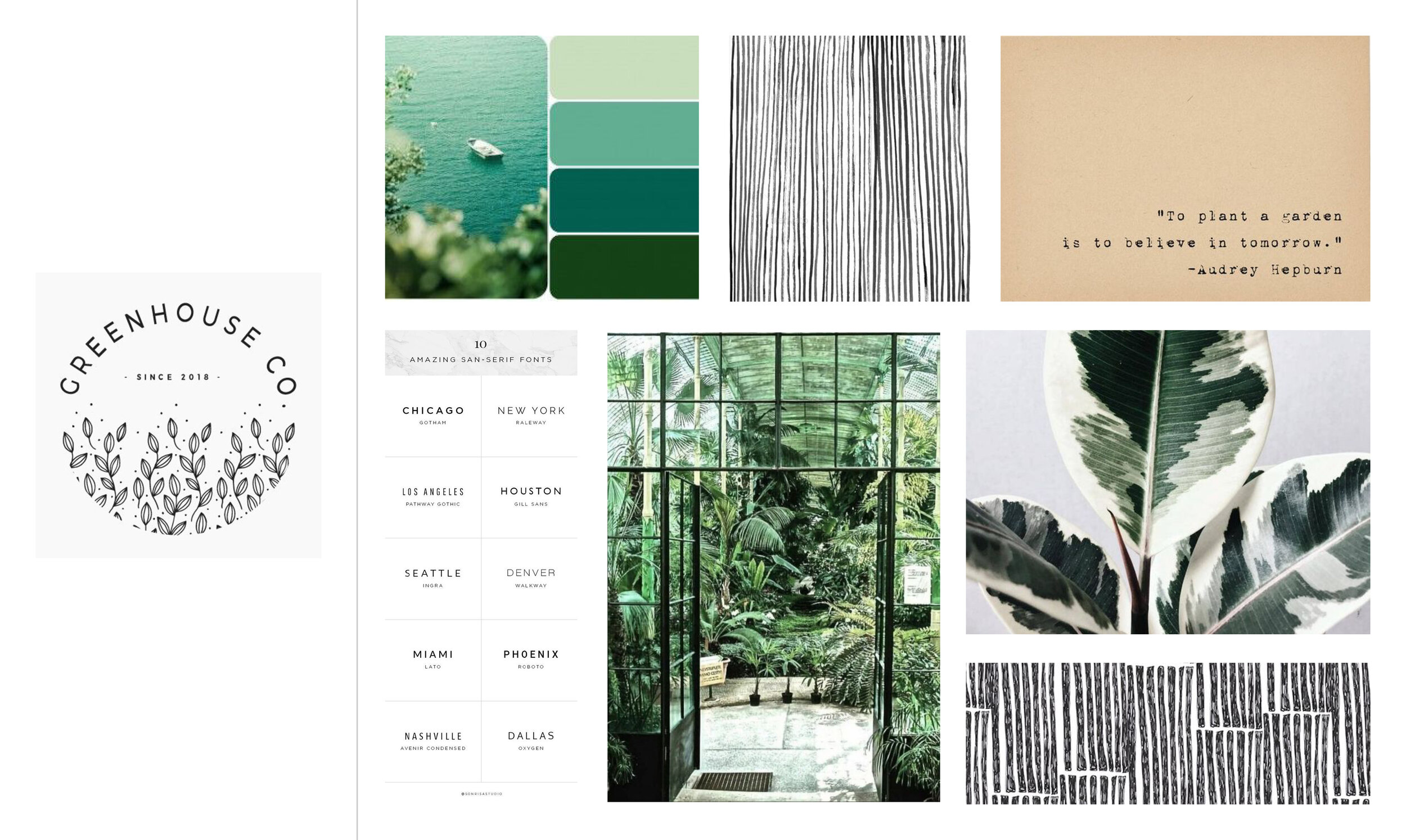
Greenhouse Co. Mood Board One: Green and Earthy
The first mood board I made for Greenhouse Co. draws on the earthy, lush qualities of a traditional greenhouse. Sans serif type paired with the typewriter-style quote offer a nice contrast of typefaces, while the black and white patterns compliment the monochrome color palette and beautiful plant photography. This mood board evokes the feelings of calm, serenity, and natural energy found in a greenhouse environment.

Greenhouse Co. Mood Board Two: Perfectly Pastel
The second mood board for Greenhouse Co. is light, airy, and full of pastels. The pink palette and sophisticated pattern are the perfect fit for the gorgeous quote and bright photography. This identity is perfect for a company specializing in weddings, boutique plants, and feminine-leaning industries.
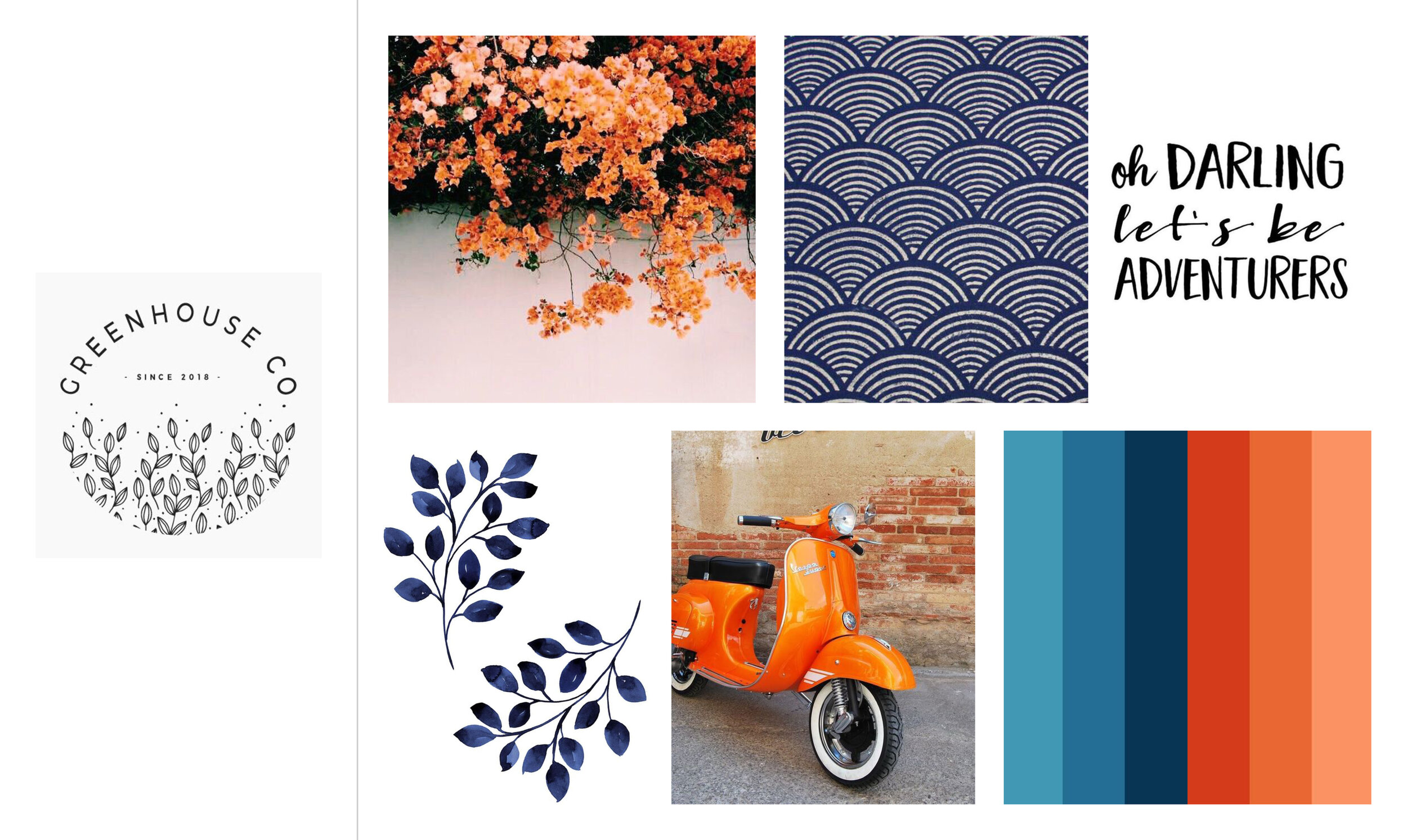
Greenhouse Co. Mood Board Three: High Contrast, High Energy
This third mood board definitely packs a punch! The high contrast of the color palette is energizing and fun, and the floral visuals paired with the Vespa and hand-written quote really tie together purpose and personality. This mood board takes me to a beautiful garden on the coast of California with plenty of sun and adventure!
When it comes down to it, a brand identity creates the emotion surrounding a business. The colors, fonts, and photography chosen to represent a brand are incredibly important to how potential customers will identify with its products or services. I hope this exercise gave a glimpse into the power of a brand identity, mood boards, and how one logo can lead to endless visual possibilities!
This post is part of my Look and Feel project—an exploration of content curation, brand identity, and visual design.